


Tiffany James isn't new to running a business. Over the years I've been in awe at her crafty prowess and her business acumen- from her days on Etsy selling supplies, blogging about garment sewing, selling amazing handcrafted lighting for the home- her versatility when it comes to craft is impressive.
It's that entrepreneurial variety that led Tiffany to the magic of mixed media crafting. She fell in love with the medium while crafting with her kids, but she struggled to find materials all in one place, let alone having a go-to resource to help her discover new products that she may have never even considered when shopping online or in person.
Tiffany wanted to open a brick-and-mortar store in her small town in Washington state, and while she waited for the perfect location to appear, we got to work on her brand identity and ecommerce website.
When chatting with Tiffany about this new venture, she said, "This is a brand new baby business, the biggest and most exciting I've attempted yet. I want to start this process off right. I would love your help solidifying my vision, particularly where branding and my online presence is concerned."
The goals for Tiffany's project were to develop a brand identity and website that reflected the heart of her business' mission: to have a space to explore, discover, and create with abandon as release and a way to express yourself.
THE WHO
While Tiffany needed a strong brand identity that spoke to her target customer, we didn't want to pigeonhole her into a style that wouldn't allow her to grow or pivot through the years.
But the most important thing needed to be done first: figuring out who her target customer was going to be, as that's who is going to be shopping on her site or in her store.
We kicked off her project with a Target Customer Exercise. I know. Yawn. BUT I've found time and time again that if you hunker down and do the foundational work involved with who your audience is, it's smooth sailing after that.
After Tiffany spent some time on the exercise, I created a persona for her to use when strategizing every facet of her business.
That way she not only could think about her desires when crafting a moodboard or sending feedback on designs, but she could also imagine what Maggie might think.

Target Customer Avatar for Paper Hearts Market
LOGO DESIGN
The first few rounds of logo concepts explored a more geometric style, evoking some origami-esque elements, yet nodding to the messier, more playful aspects of crafting.
But we weren't quite there yet. The style was a bit too modern, too sleek, and Maggie might not even notice a store with that kind of branding.
We needed it to be a little more rough around the edges, playful, and colorful.
I typically design all logos in black and white first and don't tend to add any color until the logo is finalized and approved.
But this time was different.
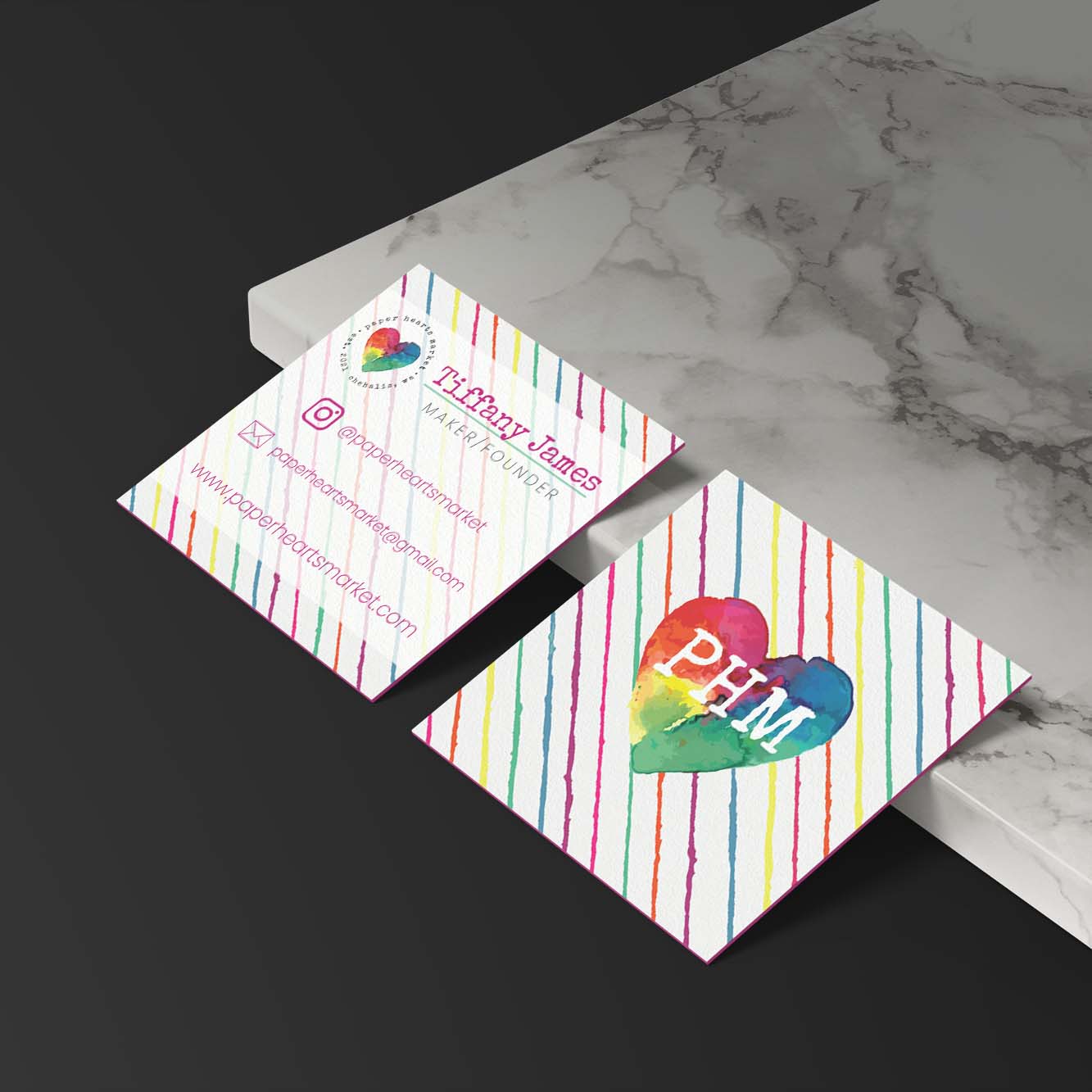
One day I busted out my watercolors, and some Brusho, and I ended up painting part of her logo.
Then I scanned and vectorized it, and that's when things started falling into place.
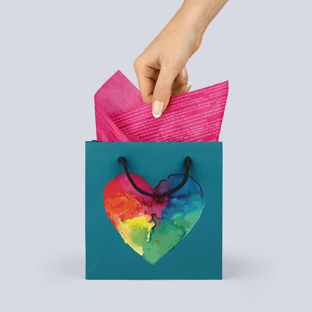
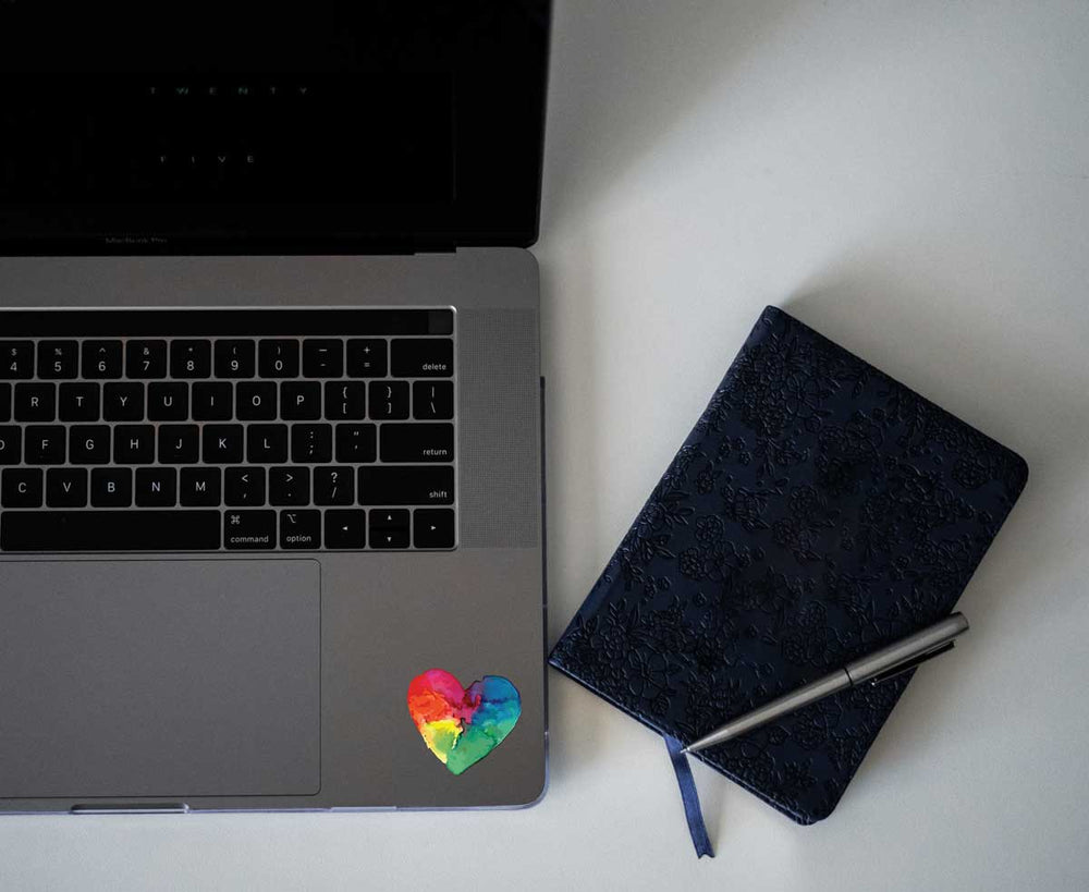
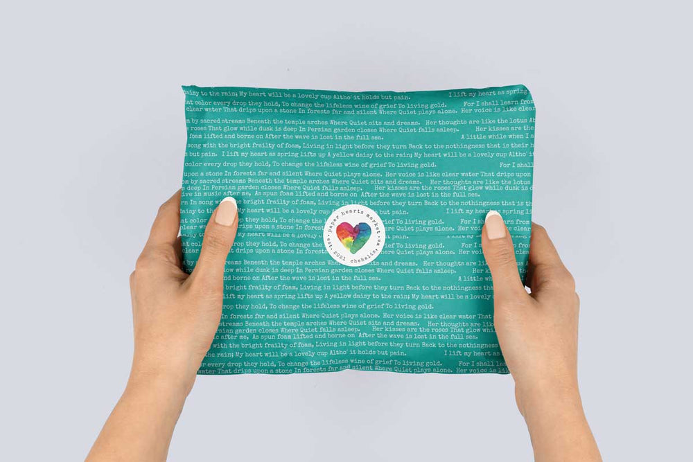
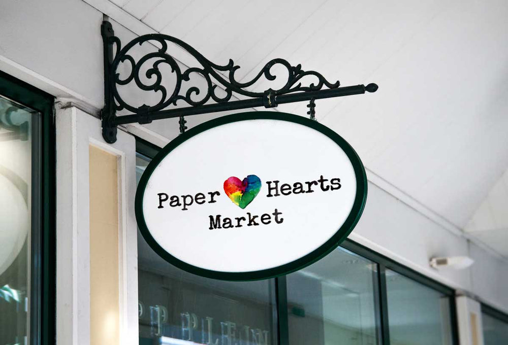
Watercolor heart that I painted, scanned and vectorized
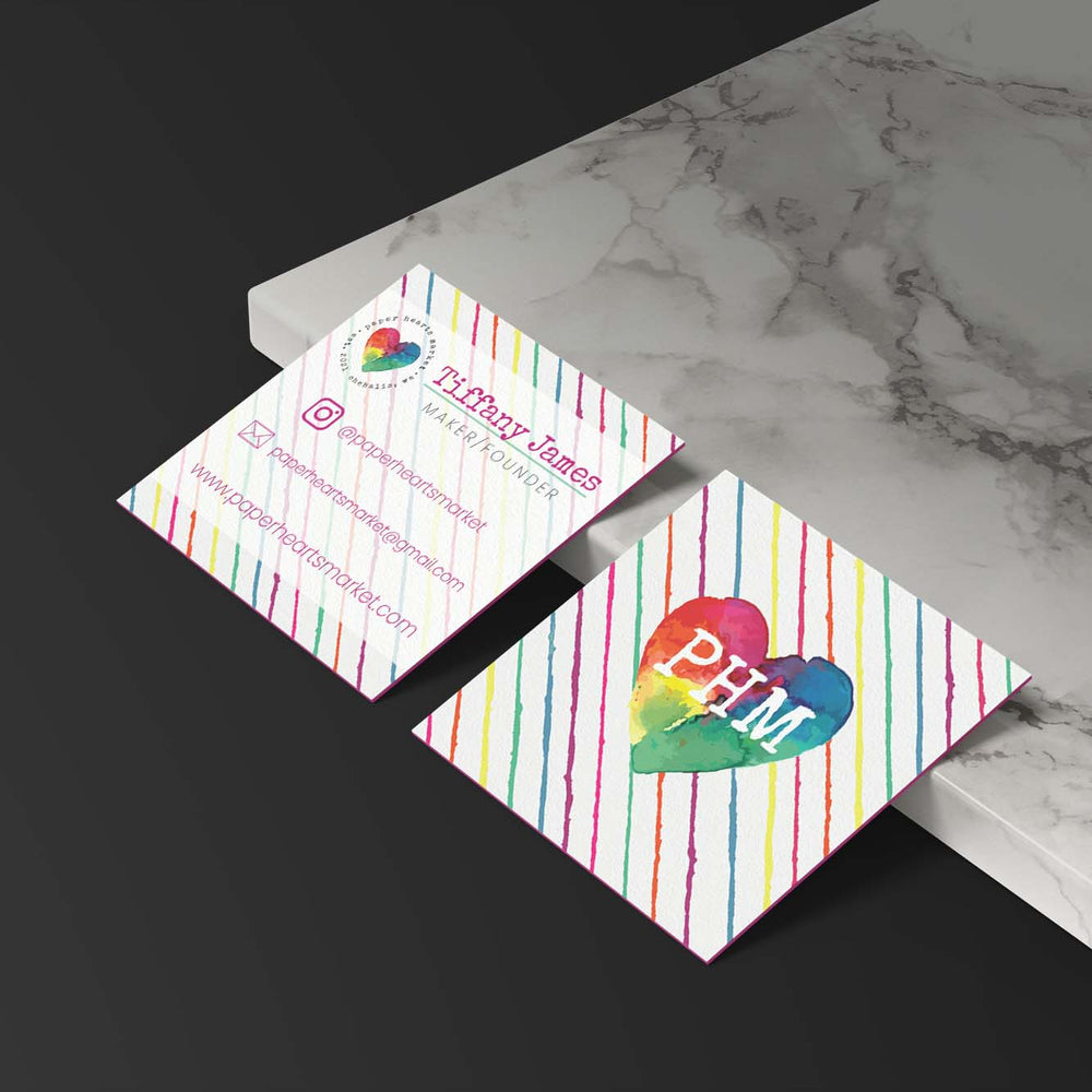
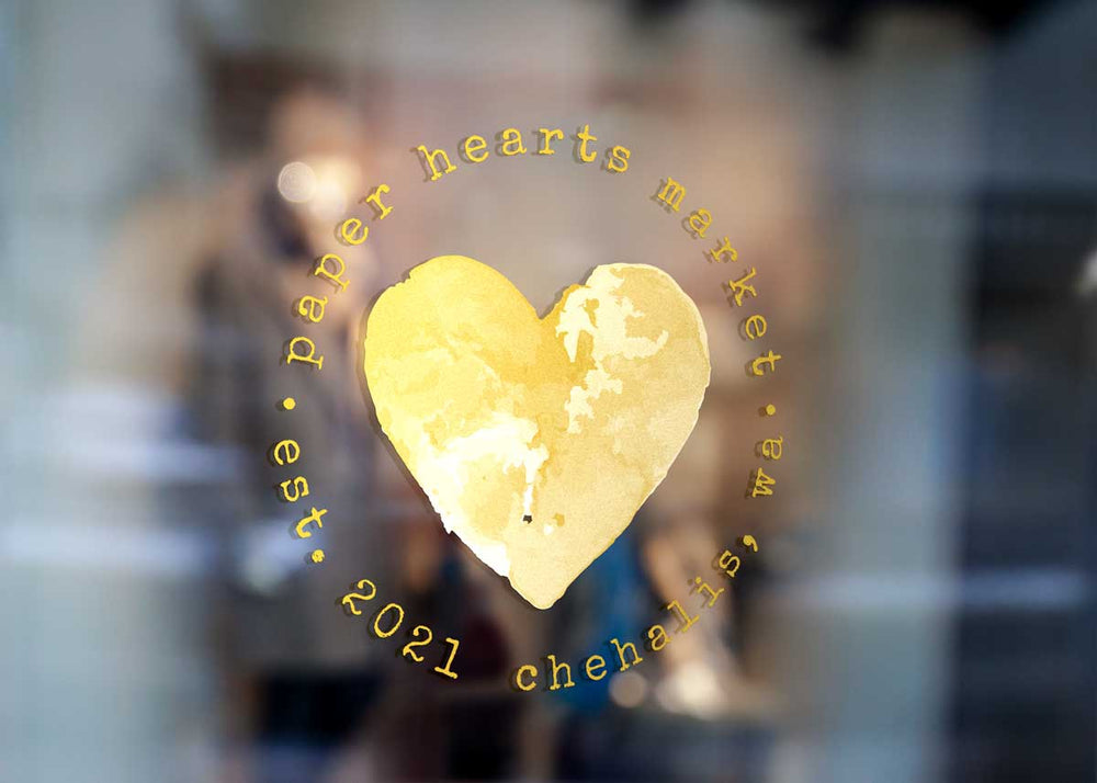
Once we got that big beautiful watercolor heart as the anchor, the rest of the brand identity followed suit. Take a look: