


Rosalie Gale owns two stores- Monster and Ugly Baby. Both are in the Seattle, Washington area, and they each have their own website and location.
I don't know how she does it, either.
The minute I read about Rosalie Gale and her business Ugly Baby on an article on Etsy's website, I knew that if we ever met, we'd totally be friends.
...As long as I didn't make that experience too weird.
Thankfully through the chaos that comes with craft shows, it (hopefully) masked (most) of my weirdness.
I said most.
I can't remember if it was Urban Craft Uprising or Crafty Wonderland, but it was at one of those Pacific Northwest shows that tend to bring creative business owners together in the best way. And that's where I got to meet Rosalie in person.
I've collected Shower Art from Ugly Baby over the years, and immediately would open any marketing email from Ugly Baby, as I knew it would be just the right amount of funny, snarky, and real.
She (and Kari Chapin) are literally the folks who finally convinced me to go to Craftcation.
Rosalie has been to every single Craftcation that has existed, and she plans to do that until they stop doing them, or she dies (her words, not mine).
So when Rosalie got word of my pivot from products to websites, she decided to get in touch.
Geeking out with Google Analytics
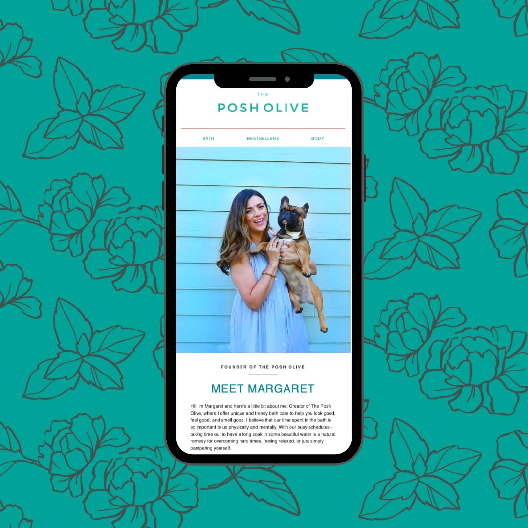
Rosalie was using a free theme from Shopify for her existing website.
There's actually nothing wrong with using a free theme. In fact, if you're just getting started with having a website, let alone one on Shopify, starting with a free theme is a great way to get started and then as you grow, you'll push the limits of the free theme until you cannot stand it anymore.
And you'll know by then what you want.
Thankfully Rosalie is smart and had Google Analytics hooked up to her website, so before we got started, we took a peek at her stats.
Her traffic was pretty split between devices- about half and half between mobile and desktop. But the mobile conversion rate could be better.
The menu had Shopping links all under a SHOP dropdown menu and was super long on desktop. The mobile menu offered a better experience than desktop, which is usually the opposite.

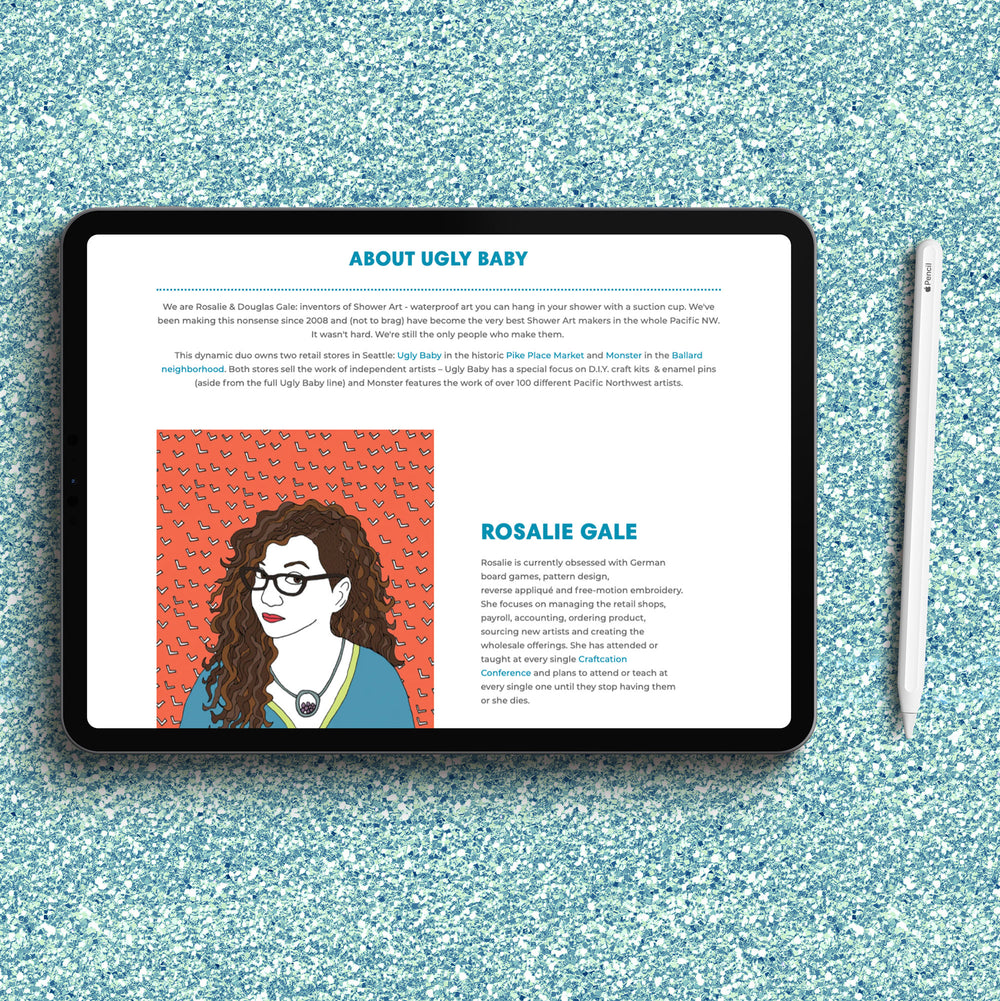
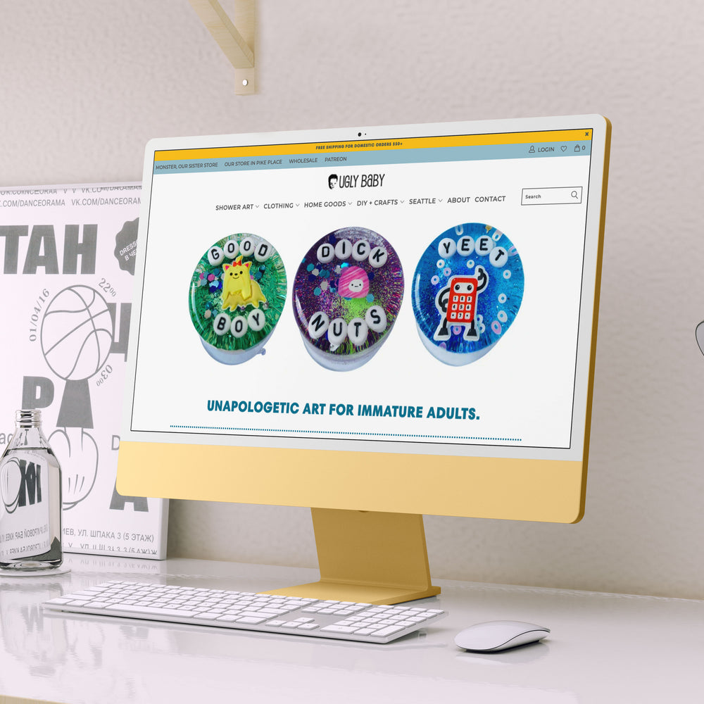
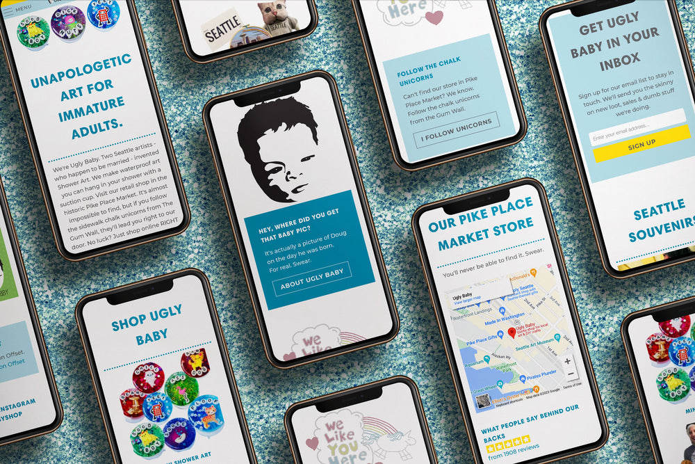
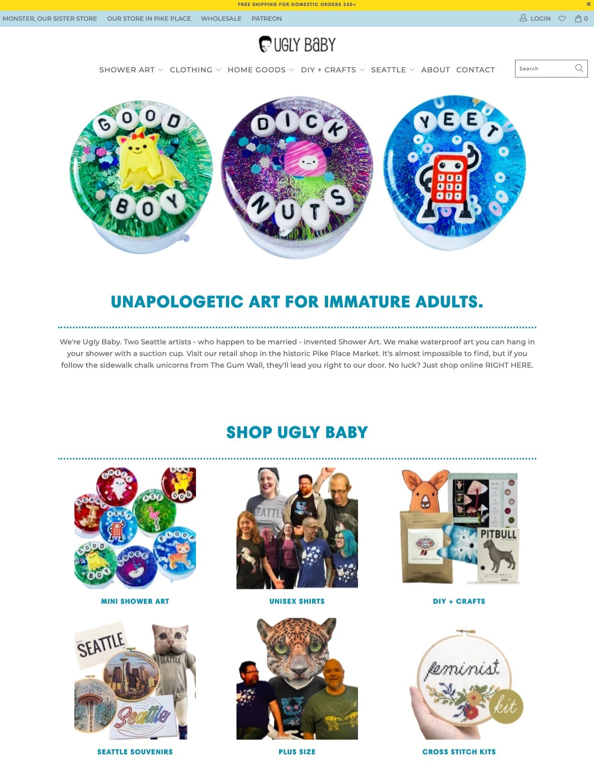
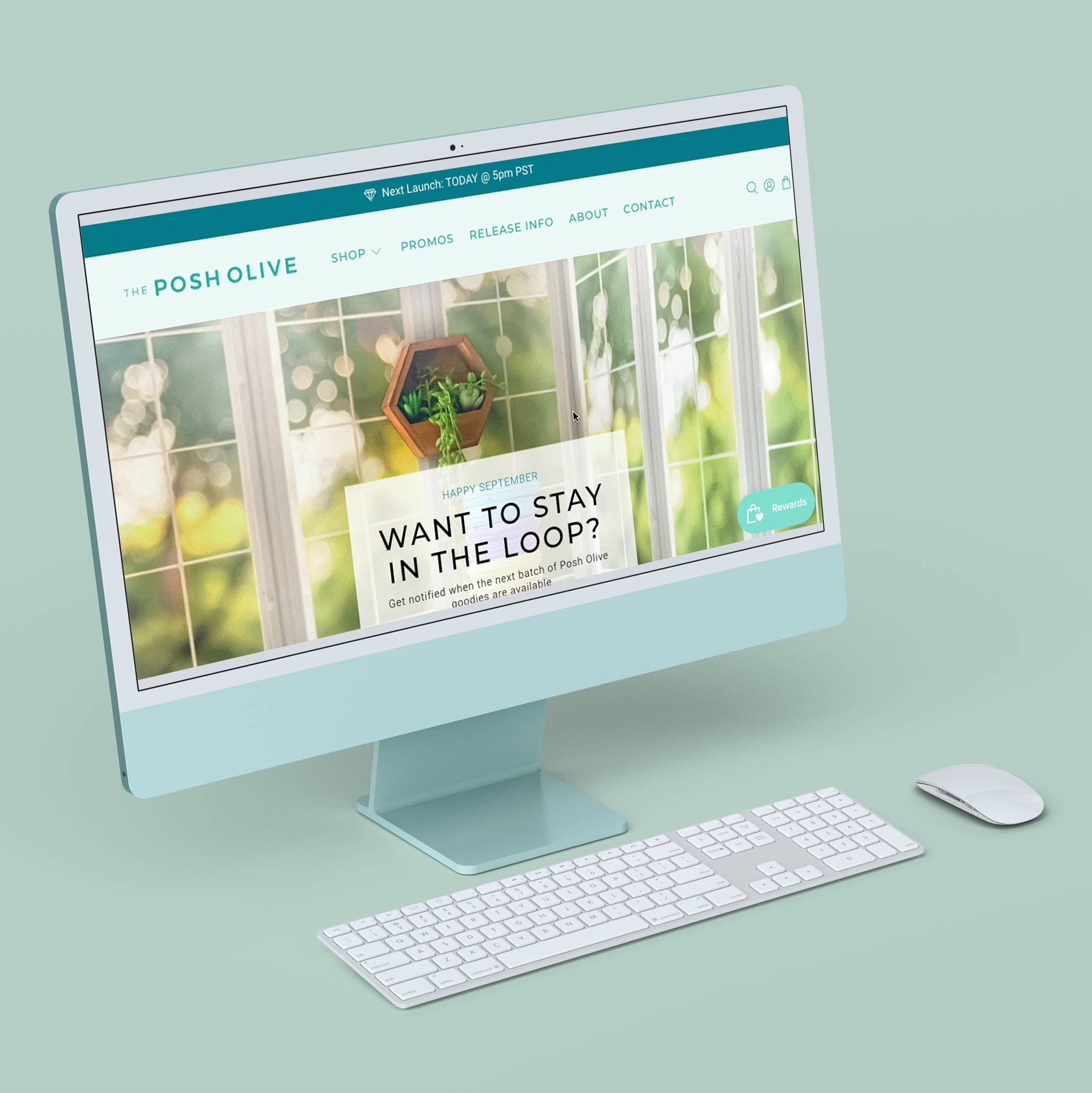
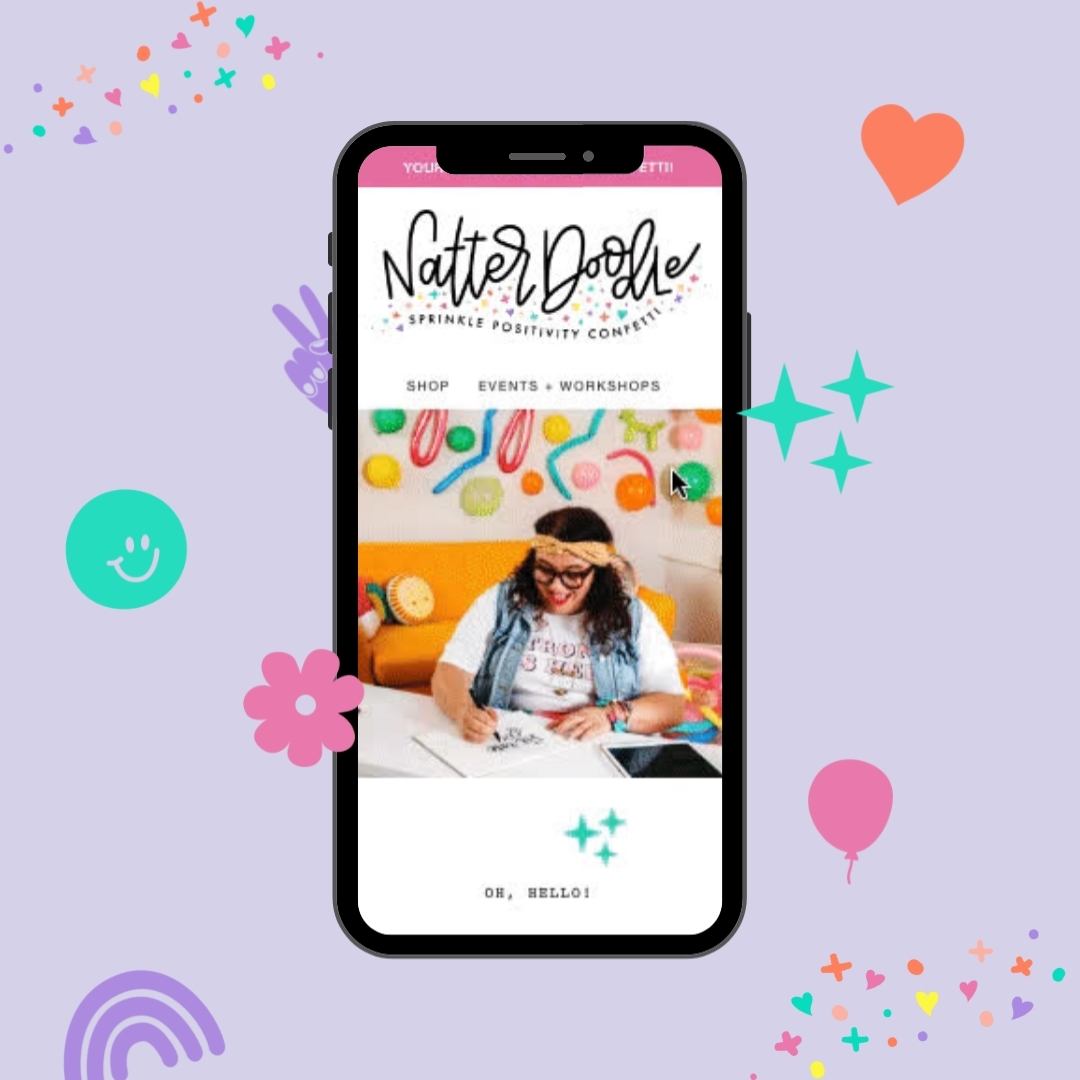
But the biggest thing that Rosalie's current site didn't capture as well: Ugly Baby's personality, their vibe.
And that's where a shiny new (paid) theme, some color, some snark, and some chalk unicorns would add some glittery sparkle to her website.
Just add glitter (and strategy)
Ok, ok we did more than just put some glitter on it.
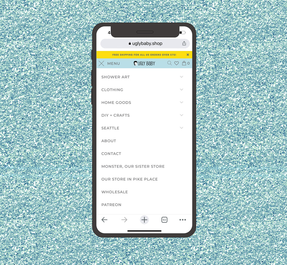
We started with one of the most important aspects of an ecommerce website: the menu/navigation.
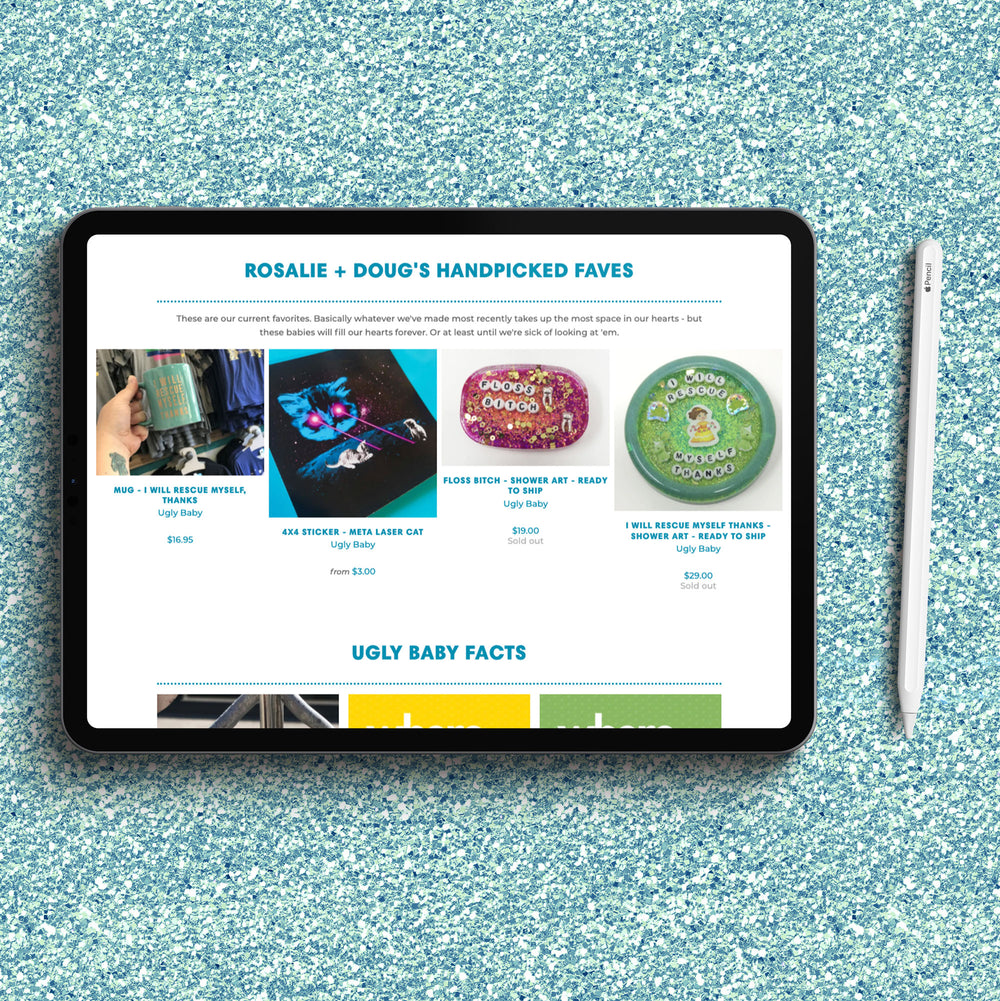
Ugly Baby not only makes and sells Shower Art, but a bunch of products featuring their own designs, and many products made and designed by other creative business owners and artists. Rosalie and I have even worked together to collab on her AT-AT Love design on baby bibs!
So we needed to be strategic about how to convey all the products Ugly Baby carried, and the mega menu was our answer.
This meant auditing, cleaning up, or creating a lot of collections in Shopify (and then we created a massive spreadsheet to keep track of all of these).
Then we switched gears to infuse more personality into the website. What was missing?